
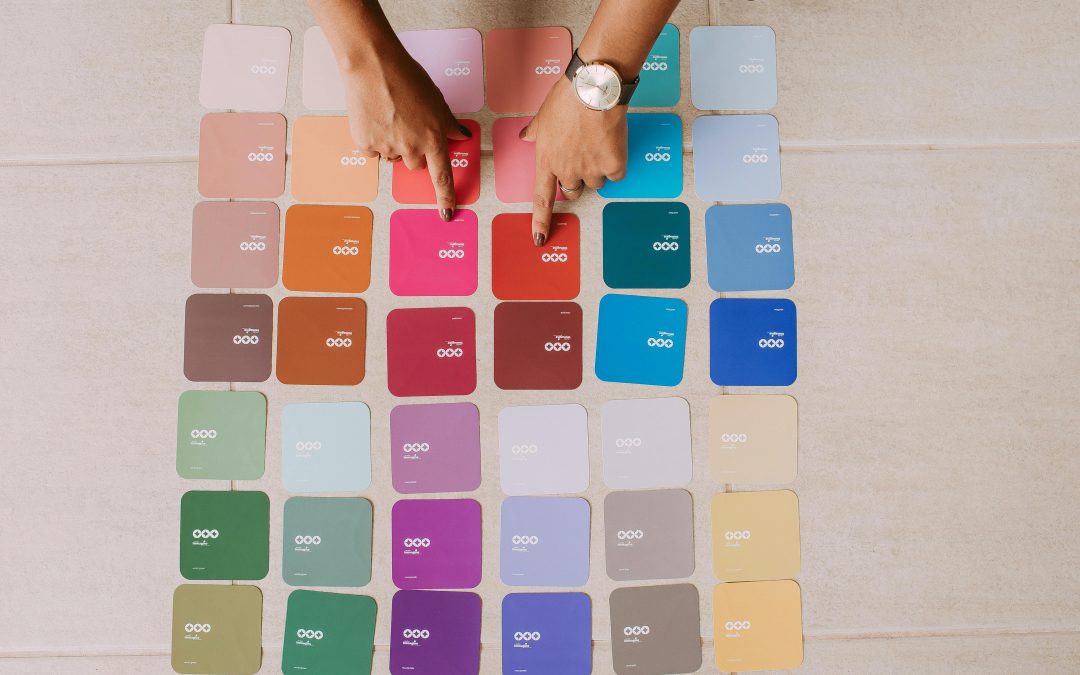
Have you ever walked into a room and instantly felt calm, energized, or even a little stressed without knowing why? Most of the time, it is not the furniture or lighting alone. It is the color on the walls quietly influencing your mood.
Designers have known this for years, and research continues to support it. According to a study published in the Journal of Environmental Psychology, color can significantly affect emotional response, behavior, and even productivity in indoor spaces. That means your paint choices are doing more than decorating your walls. They are shaping your daily experience.
Understanding color choices that change room psychology can help you create spaces that actually support how you want to live and feel.
Why Color Has a Psychological Impact
Color is processed by the brain in a way that connects directly to emotions. Different shades can trigger different responses, even if we are not fully aware of them.
For example:
- Warm colors can feel energetic or stimulating
- Cool colors often feel calming and relaxing
- Neutral tones create balance and stability
This is why the same room can feel completely different after a simple repaint. It is not just visual. It is emotional.
Soft Blues for Calm and Focus
Blue is one of the most commonly used colors in interior design for a reason. It is associated with calmness, clarity, and focus.
Using soft blue tones in bedrooms or workspaces can help:
- Reduce stress levels
- Improve concentration
- Create a peaceful atmosphere
This makes blue one of the most effective color choices that change room psychology in spaces where relaxation or productivity matters.
Warm Yellows for Energy and Positivity
Yellow is often linked to happiness and optimism. It brings warmth into a space and can make rooms feel brighter and more welcoming.
However, balance is important. Too much intense yellow can feel overwhelming, so softer shades often work best.
Yellow is great for:
- Kitchens and dining areas
- Creative spaces
- Entryways that need a welcoming feel
It encourages social interaction and positive energy.
Greens for Balance and Restoration
Green is one of the most naturally calming colors because it is strongly connected to nature. It represents balance, growth, and renewal.
Using green in interiors can help:
- Reduce eye strain
- Create a refreshing atmosphere
- Promote emotional balance
This is why green is often used in living rooms and spaces meant for relaxation.
Reds for Energy and Attention
Red is a powerful color that grabs attention immediately. It increases energy levels and can even stimulate conversation.
Because of its intensity, it works best in small doses or accent areas such as:
- Feature walls
- Dining rooms
- Decorative elements
Red is one of the boldest color choices that change room psychology, but it needs careful use to avoid overwhelming the space.
Neutrals for Stability and Simplicity
Neutral colors like white, beige, and gray are widely used in modern interiors. They create a clean and balanced backdrop that allows other design elements to stand out.
Neutrals help:
- Make spaces feel larger
- Create a sense of calm
- Provide flexibility for decor changes
They are ideal for people who prefer a minimalist and timeless look.
Earth Tones for Comfort and Warmth
Earthy shades like browns, terracotta, and warm taupes create a grounded and cozy feeling. These colors are often used to make large or cold spaces feel more inviting.
They work well in:
- Living rooms
- Bedrooms
- Rustic or natural themed interiors
Earth tones are subtle but powerful in shaping emotional comfort.
Dark Colors for Depth and Sophistication
Dark shades like navy, charcoal, and deep green can create a dramatic and sophisticated atmosphere. While some people avoid them, they can actually make spaces feel more intimate and stylish.
When used correctly, dark colors:
- Add depth and character
- Create a cozy, enclosed feel
- Highlight lighting and decor elements
They are especially effective in accent walls or smaller rooms where contrast is desired.
How Lighting Affects Color Psychology
Color does not exist in isolation. Lighting plays a huge role in how it is perceived.
For example:
- Natural light can make colors appear softer and more balanced
- Warm artificial light enhances cozy tones
- Cool lighting can make colors feel sharper and more modern
This interaction is important when choosing paint, because the same color can feel completely different depending on lighting conditions.
Choosing Colors Based on Room Purpose
One of the most practical ways to use color psychology is to match colors with room function.
Here are simple guidelines:
- Bedrooms: calming blues, soft neutrals
- Kitchens: warm yellows or clean whites
- Living rooms: balanced greens or earth tones
- Offices: focused blues or neutral shades
This helps ensure that your environment supports your daily activities.
Avoiding Common Color Mistakes
Even with good intentions, color choices can sometimes go wrong. Common mistakes include:
- Using overly bright colors in large areas
- Ignoring lighting conditions
- Mixing too many strong colors in one space
- Choosing trends instead of personal comfort
Keeping things simple and intentional usually leads to better results.
Conclusion: Color Shapes More Than Just Design
Color is one of the most powerful tools in interior design because it influences how you feel every day. It is not just about aesthetics. It is about atmosphere, mood, and experience.
By understanding color choices that change room psychology, you can design spaces that support your lifestyle instead of just filling them with paint.
Whether you want calm, energy, warmth, or focus, the right colors can help you achieve it naturally. Small changes on your walls can lead to big changes in how your home feels.