
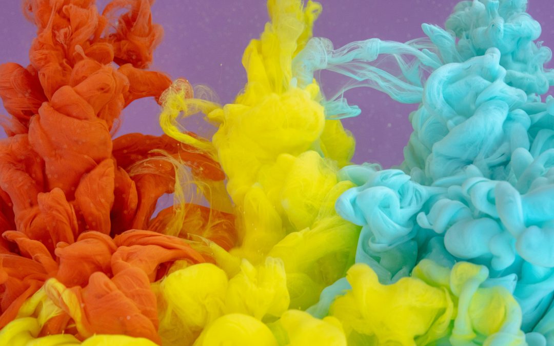
Your home’s color palette can have a surprising impact on your mood. Choosing the right hues can create a cheerful and uplifting environment that boosts your energy and makes everyday living more enjoyable. If you’re wondering which shades can bring positivity and joy, exploring paint colors that make you feel happy is a great place to start.
Studies in color psychology show that warm and vibrant colors can significantly influence mood and emotions. According to a study published in the Journal of Environmental Psychology, people in brightly colored spaces report higher levels of energy and happiness compared to neutral or dull surroundings.
Warm and Sunny Colors
Warm tones naturally evoke feelings of comfort and optimism.
- Yellow: Often associated with sunshine and positivity, yellow can brighten kitchens, dining areas, or home offices. Lighter shades create a soft, welcoming ambiance, while bold yellows energize the space.
- Orange: This vibrant hue stimulates creativity and social interaction. It’s perfect for living rooms, playrooms, or areas where you gather with family.
- Peach or Coral: Soft variations of orange are warm and inviting, creating a cozy and cheerful atmosphere without overwhelming the senses.
These shades are ideal for areas where you want to feel energetic and inspired.
Calming and Refreshing Colors
Not all happy colors are bold. Softer, calming shades can also improve mood and provide a sense of balance.
- Light Blue: Reminiscent of clear skies, light blue evokes calmness and relaxation. It works well in bedrooms and bathrooms where serenity is desired.
- Mint Green: Fresh and uplifting, mint green can make kitchens, bathrooms, or small spaces feel brighter and more spacious.
- Lavender: Gentle and soothing, lavender adds a cheerful touch without being overpowering, ideal for bedrooms or reading nooks.
These colors combine happiness with tranquility, providing both energy and relaxation.
Neutral Colors with a Happy Twist
Even neutral tones can create a positive environment when paired with warm undertones or accents.
- Creamy White: Warmer whites with a hint of yellow or peach can feel inviting and lively compared to stark, cold whites.
- Soft Beige or Taupe: Earthy neutrals can evoke comfort and stability while still brightening a room.
- Pastel Shades: Light pastels like blush pink, baby blue, or soft mint introduce subtle cheerfulness without overwhelming the space.
Neutrals with a happy twist are perfect for larger areas or open-plan homes where bright colors may be too intense.
Tips for Choosing Colors That Boost Happiness
To get the most out of paint colors that make you feel happy, consider these tips:
- Test Samples First: Paint small sections to see how colors look at different times of day and under different lighting.
- Combine Colors Thoughtfully: Pair bold hues with calming neutrals to create balance. For example, a yellow accent wall with white trim.
- Consider Room Function: Use energizing colors in social or workspaces and soothing shades in bedrooms or relaxation areas.
- Add Texture and Accessories: Rugs, cushions, and curtains in complementary colors can enhance the overall happy vibe.
- Follow Your Personal Preference: Ultimately, the colors that make you happiest are the ones that reflect your personality and taste.
These practical steps ensure that your color choices enhance mood while maintaining harmony and style.
Conclusion
Choosing paint colors that make you feel happy can transform your home from ordinary to uplifting. Warm and sunny colors like yellow, orange, and peach energize, while calming shades like light blue, mint green, and lavender create relaxation with a cheerful twist. Even neutral tones with subtle warmth or pastel accents can brighten a space and lift your mood.
By testing samples, considering room function, and pairing colors thoughtfully, you can create an environment that nurtures happiness and positivity. With the right color choices, your home will not only look beautiful but also feel joyful every day.